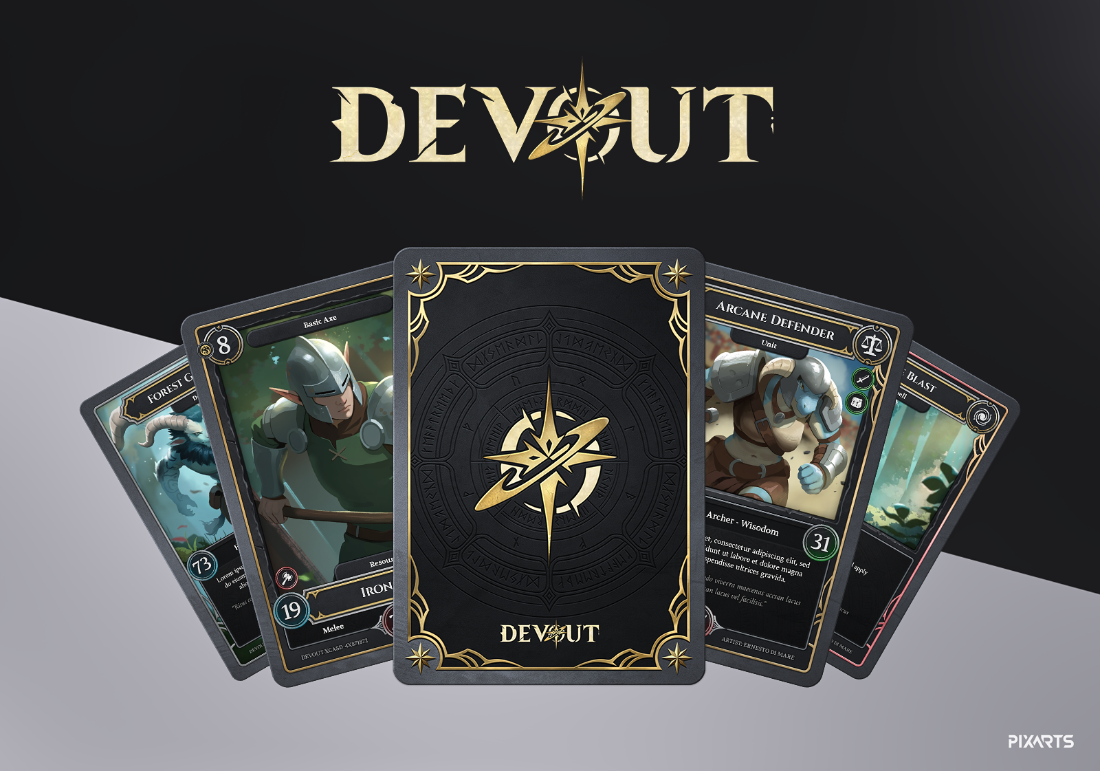
Building a brand identity for an action RPG demands a coherent visual language across every touchpoint. For Devout, we developed a complete branding system rooted in sharp metallic typography, divine symbolism, and a restrained gold-and-dark palette.
The Logo & Typography System
The Devout logotype is built around controlled tension — heavy angular letterforms balanced by a central star emblem. Every stroke width, letter spacing decision, and material finish was chosen to communicate authority without excess.
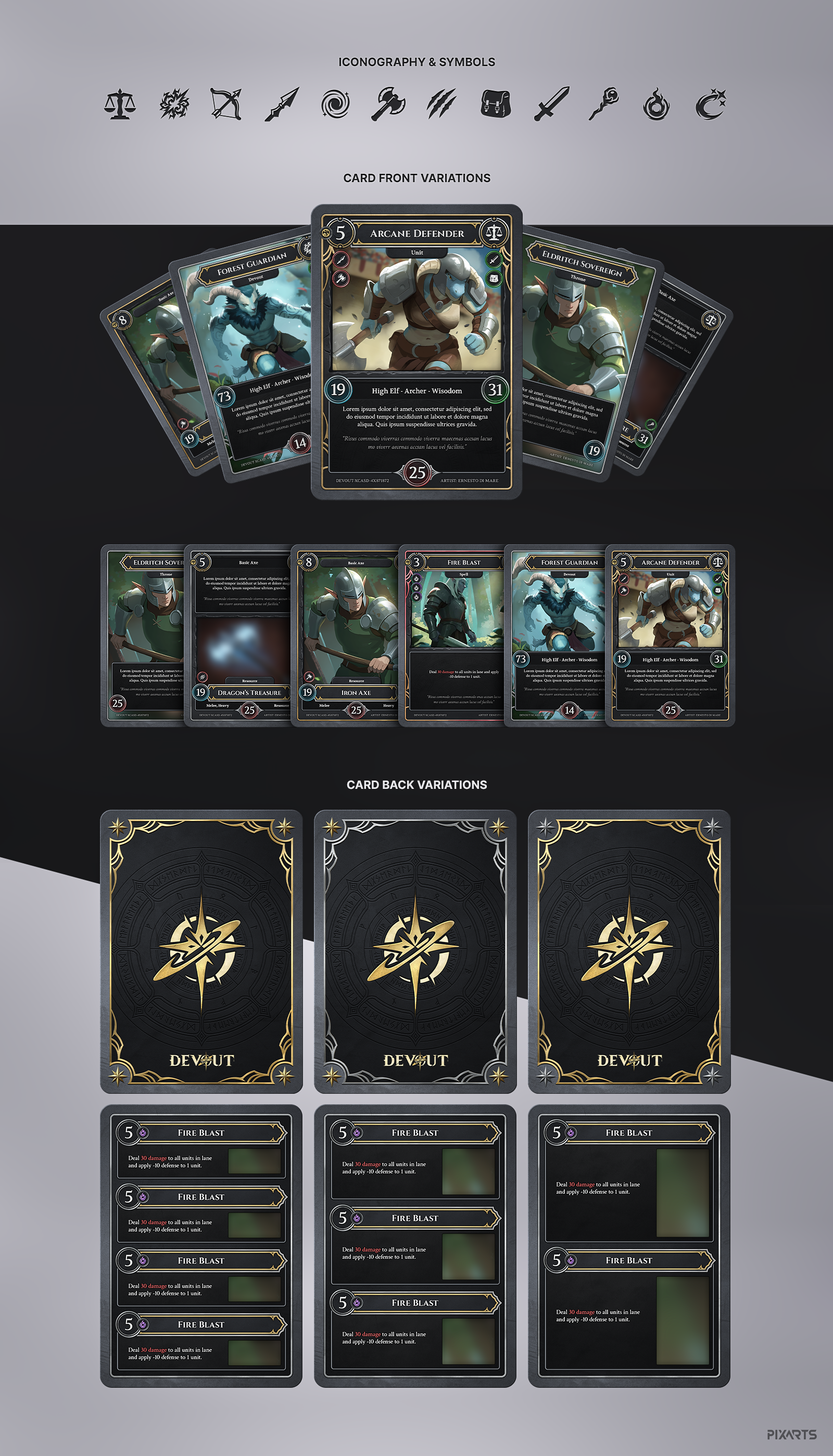
Card Frame System
The card frame system extends the brand into a full set of templates — each variant designed around card type and rarity tier. Dark backgrounds, gold borders, and a consistent typographic hierarchy ensure every frame feels part of the same universe while remaining visually distinct across rarities.
Thanks for watching!
Let's build your world.
Ready to level up your game's branding or UI? Reach out directly or use our fast project form.