Game branding for the casual and indie market requires a completely different approach than dark, realistic titles. It’s all about high contrast, thick outlines, bouncy typography, and an immediate visual punch. Below is a collection showcasing our handcrafted approach to vibrant and stylized title design.
The Craft of Color & Light
In stylized rendering, the magic happens in the reflections and soft gradients. Before an asset is finalized for the App Store or Steam capsule, we focus on making the materials look tactile—whether it's glowing neon glass, polished gold, or smooth, painted comic book textures.
The Core Anatomy
A great stylized logo must be readable even at the size of a mobile app icon. This requires a flawless, mathematically balanced vector blueprint. The grid below proves that clean, chunky typography and perfect silhouettes are the true foundations of every vibrant title we build.
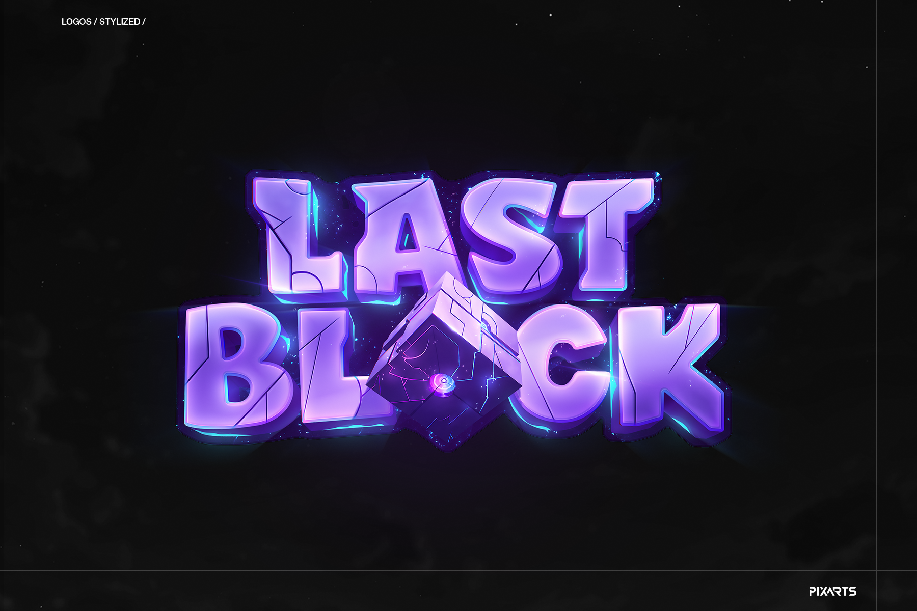
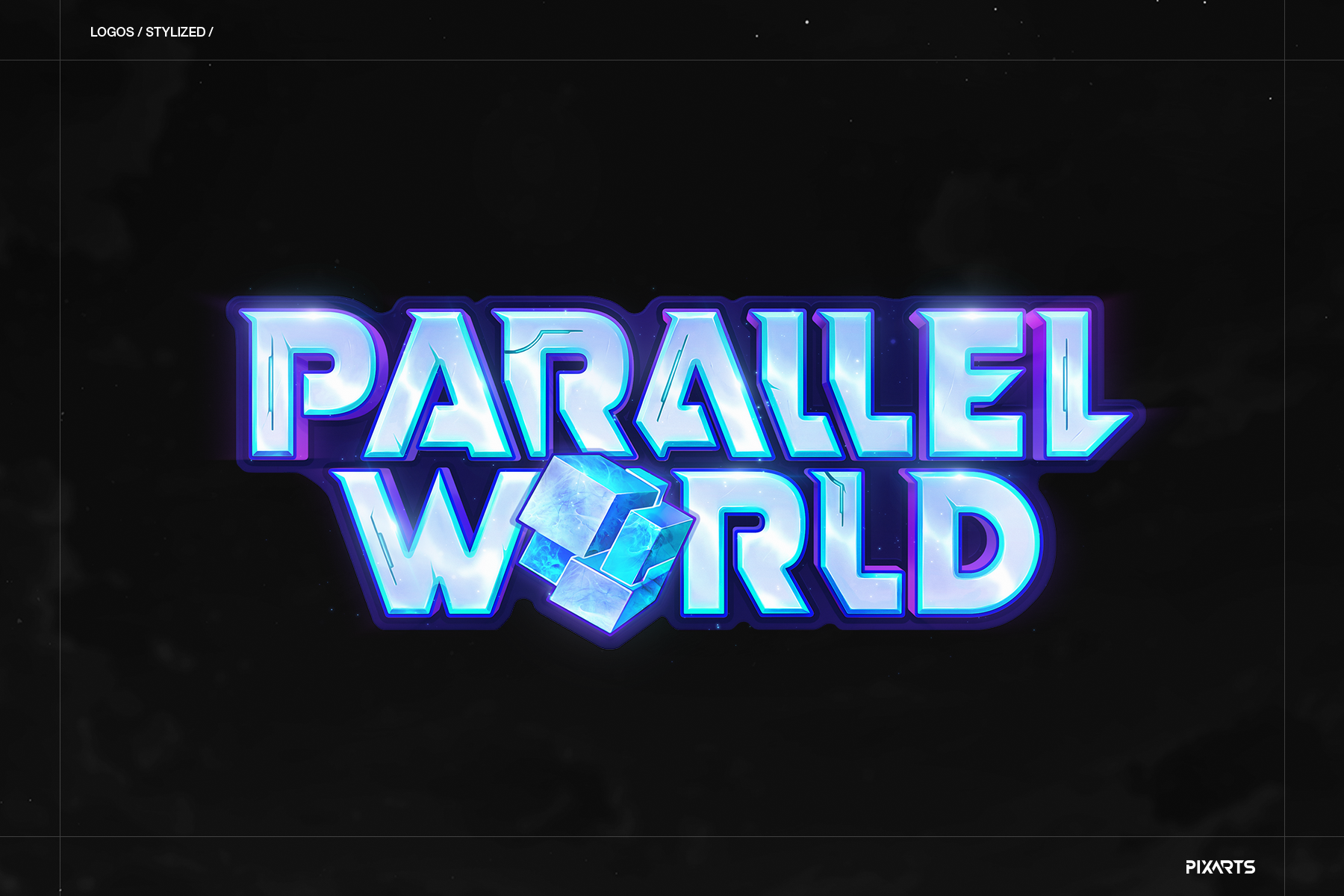
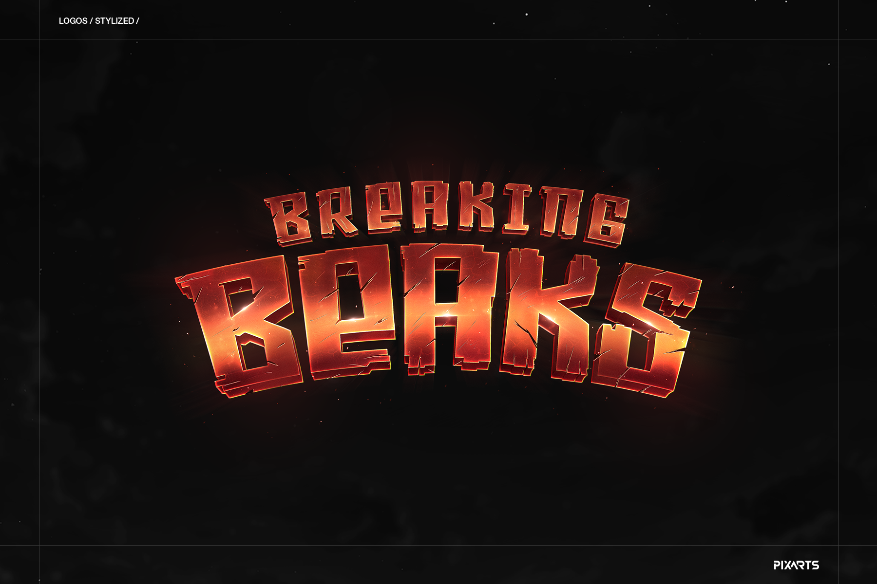
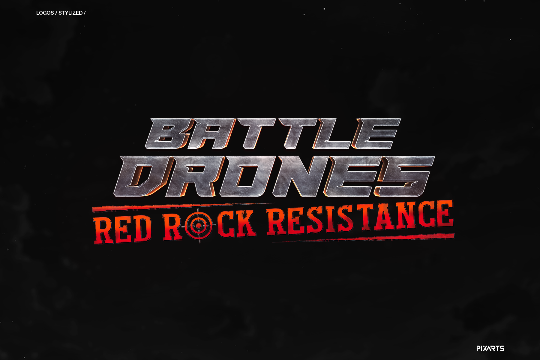
The Arcade & Indie Arsenal
Once the vector foundation is set, we bring the logomark to life. Whether it's a comic book brawler, a relaxing rhythm game, or a vibrant fantasy RPG, each asset is carefully colored and shaded to instantly communicate the genre and tone to the player.
Thanks for watching!
Let's build your world.
Ready to level up your game's branding or UI? Reach out directly or use our fast project form.